How to use Recharts to visualize analytics data (with examples)
Aug 14, 2024
Recharts is a popular charting library for React. It provides many visualization and customization options to use with analytics data in PostHog.
To provide examples of what you can do with it, we create a basic React app, set it up to get data from PostHog's query API, and visualize it with Recharts.
Don't want to do all the work of querying and visualizing? You can always share or embed insights, dashboards, and more. See sharing docs for more.
Creating a basic React app
To start, we will create a basic React app using Vite.
npm create vite@latest rechart-ph -- --template react
Once created, go into the folder, install the dependencies, and start the dev server.
cd rechart-phnpm installnpm run dev
This gives us a basic React app we can add our example visualizations to.

Querying data from PostHog
Assuming you have data in PostHog to query, the next step is to set up our query request to PostHog.
Don't have data to query? Check out our guide to setting up analytics in React to start capturing some. Unlike other tutorials, we aren't going to install PostHog in this one.
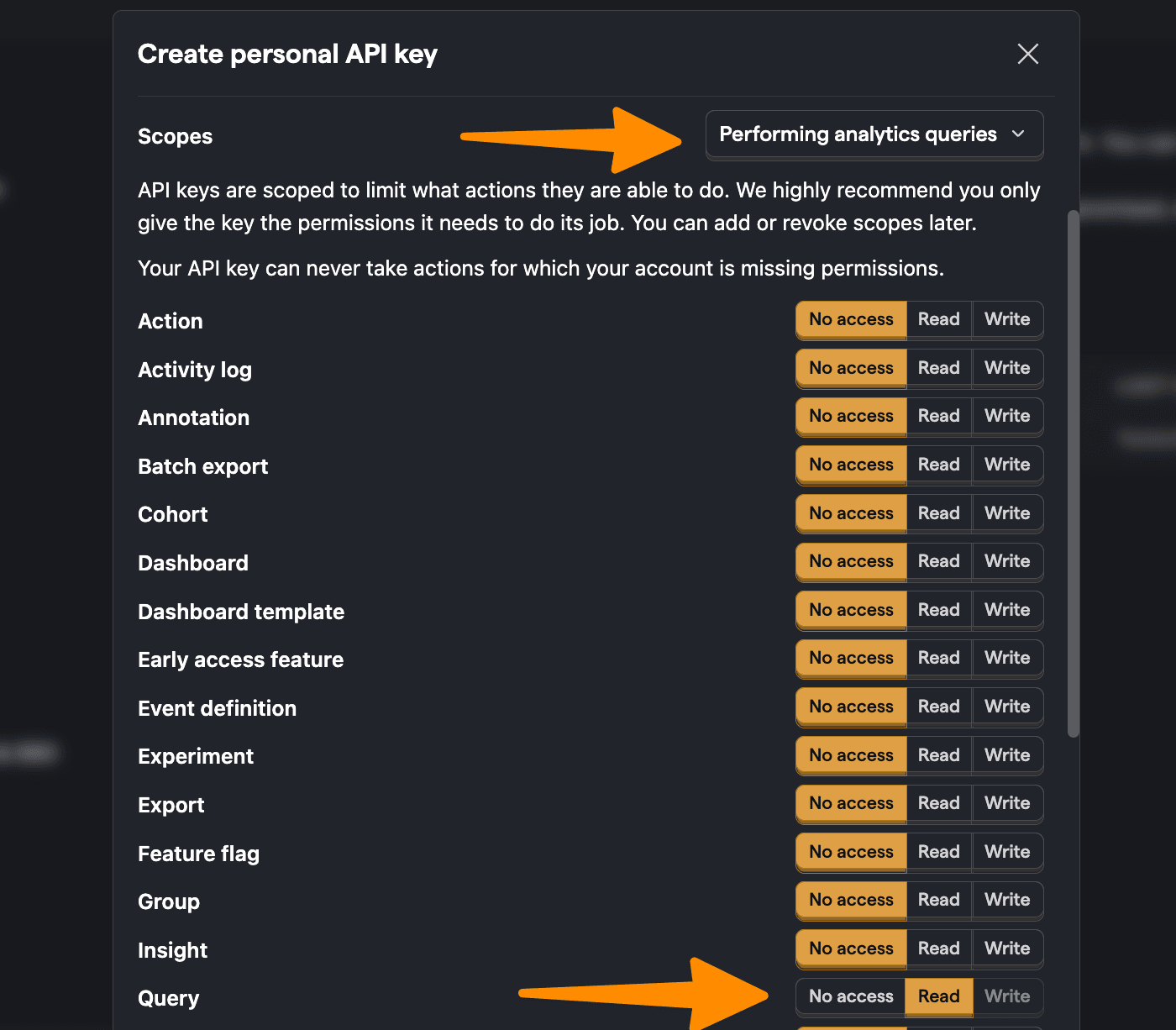
Start by creating a personal API key. You can do this by going to personal API keys in your project settings, clicking Create personal API key, giving it a label, choosing the Performing analytics queries scope (AKA query read), and clicking Create key.
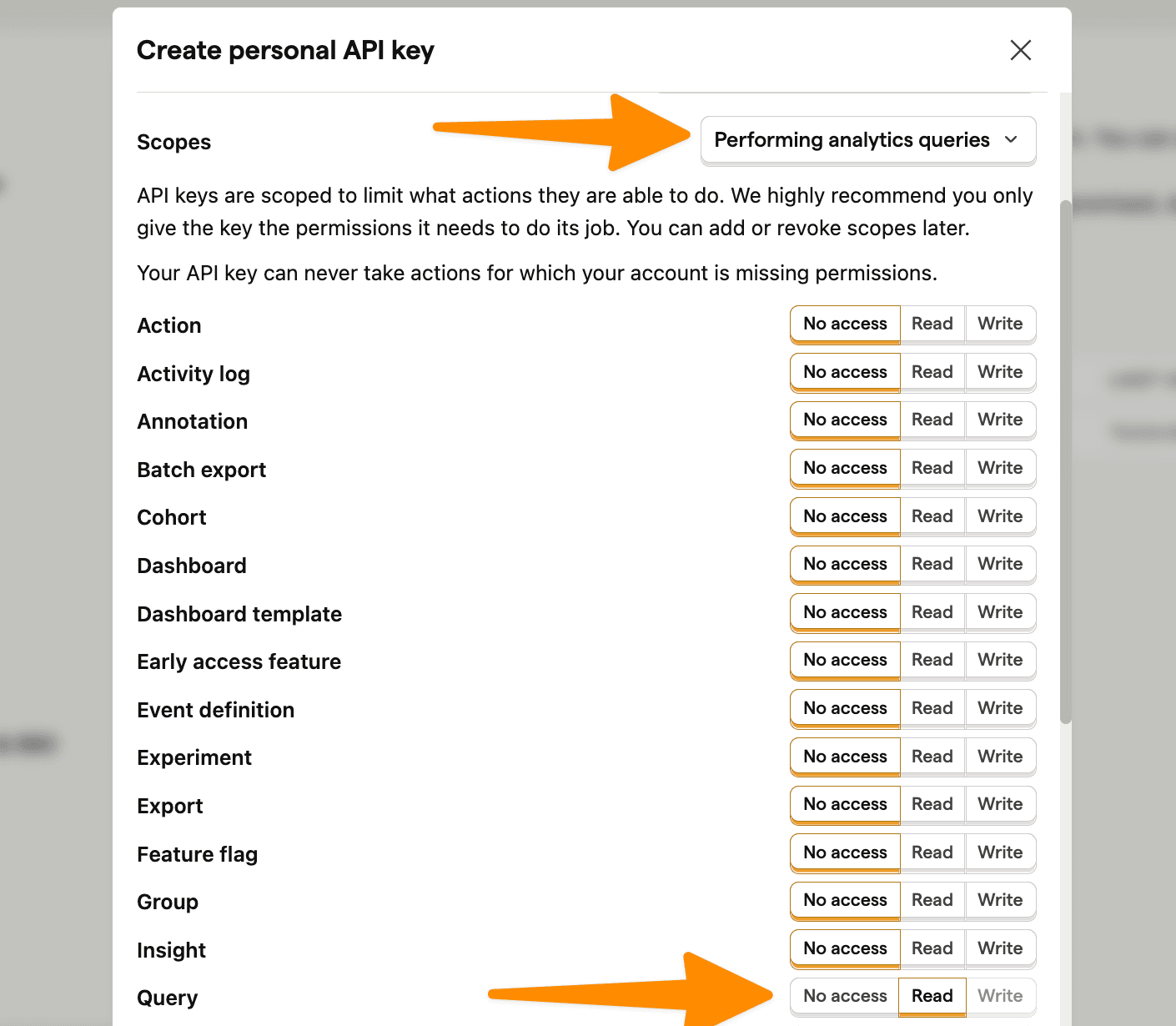
⚠️ Warning: The following is a simplified example. Exposing your personal API key (like we do below) exposes your private PostHog data to the public internet, so don't do this in real life. Make sure your personal API key isn't exposed and your query request happens securely on the server side.
With this personal API key, we can set up a request in our React app to PostHog's query API endpoint using your project ID. We use HogQL in the payload to get the data we want and display it unformatted in our app for now:
import { useState, useEffect } from 'react'import './App.css'function App() {const [data, setData] = useState([])const projectId = "12345"useEffect(() => {const fetchQuery = async () => {const url = `https://us.posthog.com/api/projects/${projectId}/query/`;const headers = {"Content-Type": "application/json","Authorization": "Bearer phx_1a2b3c4d5e6f7g8h9i0j1k2l3m4n5o6p7q8r9s0tuvwxyz"};const payload = {"query": {"kind": "HogQLQuery","query": "select properties.$current_url from events where properties.$current_url != null limit 10"}}try {const response = await fetch(url, {method: "POST",headers: headers,body: JSON.stringify(payload),});const data = await response.json();setData(data.results)} catch (error) {console.error("Error fetching data:", error);}}fetchQuery();}, []);return (<><pre>{JSON.stringify(data, null, 2)}</pre></>)}export default App
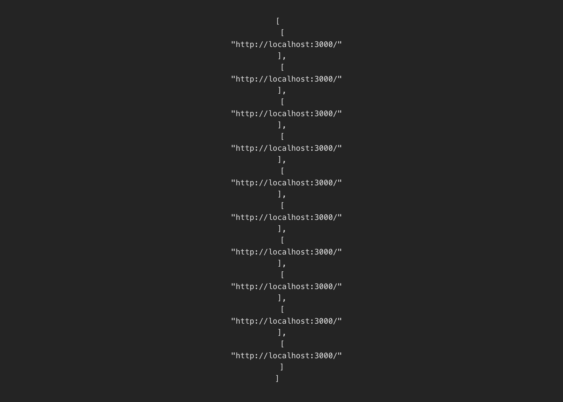
The page we end up with is just an ugly collection of non-aggregated data, but we'll fix that next.
Visualizing data with Recharts
Now that we have our app and data source set up, it is time to visualize it. To start, we install Recharts:
npm install recharts
Once done, we can simply import the necessary components along with our query. Some useful queries and visualizations include:
Line chart of pageviews by day
A basic query to start with is getting the count of $pageview
events by day. To do this, we:
- Write a query to select the date and
count()
of$pageview
events grouped and ordered by date. - Change the format of the data from the array PostHog provides the object Recharts expects.
- Import and use the
LineChart
,Line
,XAxis
,YAxis
, andTooltip
components fromrecharts
to create our chart.
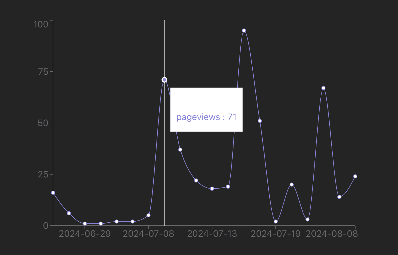
Together, this looks like this:
import { useState, useEffect } from 'react'import './App.css'import { LineChart, Line, XAxis, YAxis, Tooltip } from 'recharts';function App() {const [data, setData] = useState([])const projectId = "12345"useEffect(() => {const fetchQuery = async () => {const url = `https://us.posthog.com/api/projects/${projectId}/query/`;const headers = {"Content-Type": "application/json","Authorization": "Bearer phx_1a2b3c4d5e6f7g8h9i0j1k2l3m4n5o6p7q8r9s0tuvwxyz"};const payload = {"query": {"kind": "HogQLQuery","query": `SELECTtoDate(timestamp) AS date,count() AS pageview_countFROM eventsWHERE event = '$pageview'GROUP BY dateORDER BY date DESCLIMIT 20`}}try {const response = await fetch(url, {method: "POST",headers: headers,body: JSON.stringify(payload),});const data = await response.json();setData(data.results.reverse());} catch (error) {console.error("Error fetching data:", error);}}fetchQuery();}, []);const formattedData = data.map(([date, count]) => ({date,pageviews: count}));return (<><LineChart width={600} height={400} data={formattedData}><XAxis dataKey="date" /><YAxis /><Tooltip /><Line type="monotone" dataKey="pageviews" stroke="#8884d8" /></LineChart></>)}export default App
This creates a basic chart of pageviews by date:
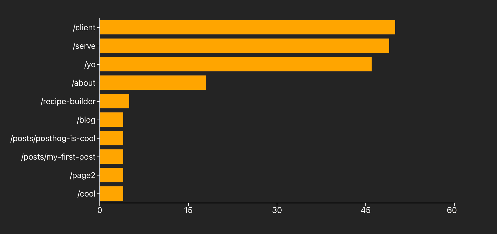
Bar chart of most popular paths
We can write a similar query to get the top paths by a count of pageviews. We basically swap in properties.$pathname
AKA pathname
, filter out null values, and order by the pageview_count
.
The challenge is getting all this data to fit. To do this, we set the Rechart BarChart
component to the vertical layout and increase the width of both the whole component and the YAxis
. On top of this, we change the colors to make it stand out.
Together this looks like this:
//... importsimport { BarChart, Bar, XAxis, YAxis, Tooltip } from 'recharts';function App() {// ... useState, useEffect, fetch request, etc.const payload = {"query": {"kind": "HogQLQuery","query": `SELECTproperties.$pathname AS pathname,count() AS pageview_countFROM eventsWHEREevent = '$pageview'AND properties.$pathname IS NOT NULLAND properties.$pathname != '/'GROUP BY pathnameORDER BY pageview_count DESCLIMIT 10`}}try {const response = await fetch(url, {method: "POST",headers: headers,body: JSON.stringify(payload),});const data = await response.json();setData(data.results);} catch (error) {console.error("Error fetching data:", error);}}fetchQuery();}, []);const formattedData = data.map(([pathname, count]) => ({pathname,pageviews: count}));return (<><BarChart width={1000} height={400} data={formattedData} layout='vertical' ><XAxis type="number" stroke='white' /><YAxis type="category" dataKey="pathname" width={300} stroke='white' /><Tooltip /><Bar dataKey="pageviews" fill="#FFA500" activeBar={false} /></BarChart></>)}export default App
This creates a bar chart that looks like this:
Stacked area of browsers
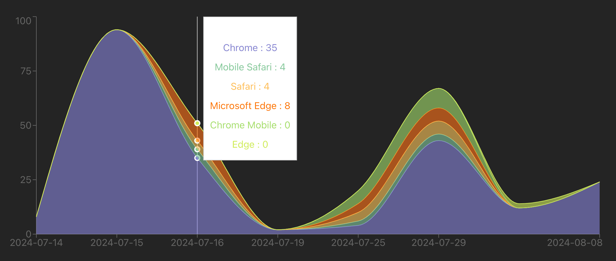
We can do a more complicated visualization of pageviews by browser. The tricky part is formatting the data to work with the visualization. The input data from PostHog looks like this:
[['2023-05-01', 'Chrome', 100],['2023-05-01', 'Firefox', 50],['2023-05-02', 'Chrome', 120],]
The data we want for the visualization looks like this:
[{ date: '2023-05-01', Chrome: 100, Firefox: 50 },{ date: '2023-05-02', Chrome: 120, Firefox: 0 }]
This means we must loop through the data, create entries for each date, and add pageviews for each browser to the date entry. Once formatted, we can use the AreaChart
to visualize it. Together, this looks like this:
//... importsimport { AreaChart, Area, XAxis, YAxis, Tooltip } from 'recharts';function App() {// ... useState, useEffect, fetch request, etc.const payload = {"query": {"kind": "HogQLQuery","query": `SELECTtoDate(timestamp) AS date,properties.$browser AS browser,count() AS pageview_countFROM eventsWHERE event = '$pageview' AND properties.$browser IS NOT NULLGROUP BY date, browserORDER BY date DESC, pageview_count DESCLIMIT 20`}}try {const response = await fetch(url, {method: "POST",headers: headers,body: JSON.stringify(payload),});const data = await response.json();console.log(data.results);setData(data.results.reverse());} catch (error) {console.error("Error fetching data:", error);}}fetchQuery();}, []);const browsers = [...new Set(data.map(([_, browser]) => browser).filter(Boolean))];const formattedData = data.reduce((acc, [date, browser, count]) => {const existingDate = acc.find(item => item.date === date);if (existingDate) {existingDate[browser] = count;} else {const newEntry = { date };browsers.forEach(b => newEntry[b] = 0);newEntry[browser] = count;acc.push(newEntry);}return acc;}, []);const colors = ['#8884d8', '#82ca9d', '#ffc658', '#ff7300', '#a4de6c', '#d0ed57', '#83a6ed', '#8dd1e1'];return (<><AreaChart width={1000} height={400} data={formattedData}><XAxis dataKey="date" /><YAxis /><Tooltip />{browsers.map((browser, index) => (<Areakey={browser}type="monotone"dataKey={browser}stackId="1"stroke={colors[index % colors.length]}fill={colors[index % colors.length]}/>))}</AreaChart></>)}export default App
This gives a visualization that looks like this:
Pie chart of operating systems
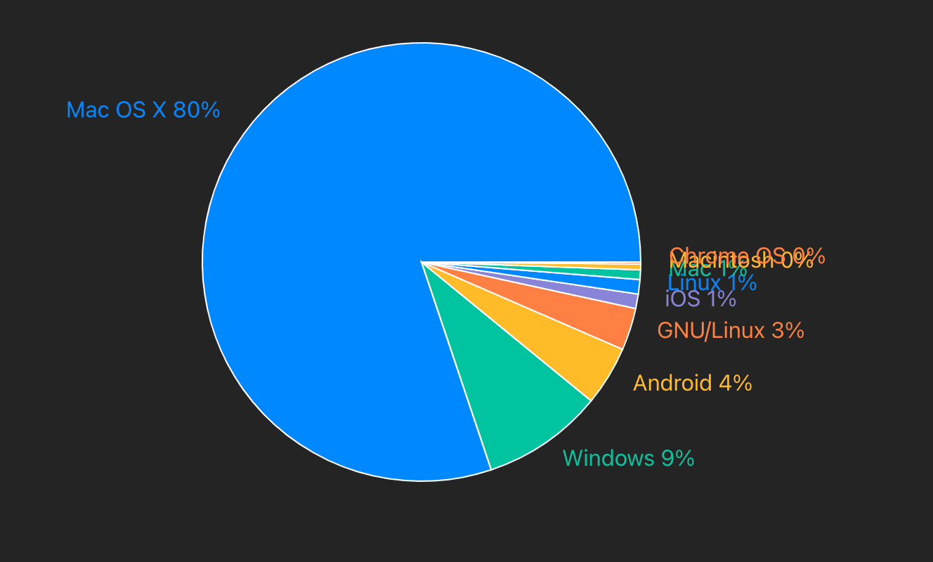
The last visualization we can set up is a pie chart of operating systems. We can get the data by getting a count of $pageview
events by properties.$os
. We then format this data and set up custom labels and colors for the pie chart.
Together, this looks like this:
//... importsimport { PieChart, Pie, Cell } from 'recharts';function App() {// ... useState, useEffect, fetch request, etc.const payload = {"query": {"kind": "HogQLQuery","query": `SELECTproperties.$os AS os,count() AS pageview_countFROM eventsWHERE event = '$pageview'AND properties.$os IS NOT NULLGROUP BY osORDER BY pageview_count DESC`}}try {const response = await fetch(url, {method: "POST",headers: headers,body: JSON.stringify(payload),});const data = await response.json();console.log(data.results);setData(data.results);} catch (error) {console.error("Error fetching data:", error);}}fetchQuery();}, []);const formattedData = data.map(([os, pageview_count]) => ({name: os,pageview_count}));const colors = ['#0088FE', '#00C49F', '#FFBB28', '#FF8042', '#8884D8'];return (<><PieChart width={600} height={400}><Piedata={formattedData}dataKey="pageview_count"nameKey="name"cx="50%"cy="50%"label={({ name, percent }) => `${name} ${(percent * 100).toFixed(0)}%`}labelLine={false}>{formattedData.map((entry, index) => (<Cell key={`cell-${index}`} fill={colors[index % colors.length]} />))}</Pie></PieChart></>)}export default App
This creates a nice-looking pie chart with labels like this:
Further reading
- The basics of SQL for analytics
- How Mintlify launched user-facing analytics, powered by PostHog
- How to use React Charts to visualize analytics data (with examples)
Subscribe to our newsletter
Product for Engineers
Read by 25,000+ founders and builders.
We'll share your email with Substack